News roundup

A few tidbits of recent news:

There’s an interesting article in the New York Times on what is described as ‘elderspeak‘: the use of kindly but demeaning and belittling forms of address towards elders by medical professions.  What isn’t discussed, as noted in Ozarque’s Journal, is that this register is essentially restricted to talking to female elders, and that it is not only the words used, but the variety of paralinguistic contextual information (body language, intonation, etc.) that makes this form of language use so odious.

In the news from Near Eastern epigraphy, a bowl has been found at Alexandria dating between the 2nd century BC and the 1st century AD describing ‘Christ’ as a ‘magician’ (goistais).    Or maybe it is describing ‘Chrestos’, a member of an association known as Ogoistais.   The dating is broad enough to refer to either a pre-Christian or early Christian context, and probably we will never know any more than that.

As someone who has studied Latin, one of my pet peeves is the notion that learning Latin (as opposed to learning any other language) is a key to academic success.  I believe that the correlation between taking Latin and academic success is the other way around: bright, intellectually curious students take Latin, but were predisposed to academic success anyway.  We have another article in the New York Times this week suggesting that thousands more students are picking Latin than in the recent past; I welcome the trend, but wonder whether these kids are taking the subject for the right reason.

Finally, a recent evolutionary-psychological study suggests that women prefer more intelligent men for both short and long-term relationships: that even in terms of thinking about a ‘fling’, there was some observable effect of intelligence on sexual appeal after watching videos of various potential mates.   I’m not going to get started on studies like this today, but stay tuned.   My own anecdotal evidence (sample of one) suggests that this finding is at best an exaggeration …

Ig Nobel 2008

Last Thursday, the 2008 Ig Nobel awards were given out, recognizing scientific achievements “that first make people laugh, and then make them think” (http://improbable.com/ig).    I am pleased to announce that once again, anthropological knowledge (irrespective of the affiliations of the researchers) has made a substantial impact on the field of weird research, with no less than three awards given in three very different areas of research:

Evolutionary anthropologists will be thrilled to hear that Geoffrey Miller, Joshua Tybur and Brent Jordan won the Ig Nobel for economics for their article ‘Ovulatory Cycle Effects on Tip Earnings by Lap Dancers‘, in which they demonstrate that strip club dancers earn significantly larger tips while in estrus than while menstruating, but that those who use contraceptives show no peaks and valleys in their earnings.   This represents the first time that human estrus has been demonstrated empirically to have economic effects in the real world.

In archaeology, Astolfo G. Mello Araujo and Jose Carlos Marcelino have won the Ig Nobel in archaeology for their insightful, ‘The role of armadillos in the movement of archaeological materials‘.   For the first time, we know not only that armadillos do play such a role, but specifically what sorts of post-depositional activity can be attributed to the critters.

Of relevance to linguistic and organizational anthropology, David Sims has won the Ig Nobel for literature for ‘You Bastard: A Narrative Exploration of the Experience of Indignation within Organizations‘.  This is a fascinating study of interpersonal relations gone wrong in the workplace, using ethnographic and linguistic methodologies to demonstrate how and why certain people are demonized as ‘bastards’.  I’ve known of this article for a while, and am using it next term in my Language and Society course.

Congratulations to all the winners!

Works cited

Mello Araujo, Astolfo G. and Jose Carlos Marcelino. 2003. The role of armadillos in the movement of archaeological materials: an experimental approach. Geoarchaeology 18(4): 433-460.

Miller, Geoffrey, Joshua M. Tybur and Brent D. Jordan. 2007. Ovulatory Cycle Effects on Tip Earnings by Lap Dancers: Economic Evidence for Human Estrus? Evolution and Human Behavior 28(6): 375-381.

Sims, David. 2005. You bastard: a narrative exploration of the experience of indignation within organizations. Organization Studies 26(11): 1625-1640.

Four Stone Hearth

Much to my great surprise and immense pleasure, Glossographia has been mentioned in the latest Four Stone Hearth, the four-field anthropology blog carnival, hosted this time by Clashing Culture.  Welcome to all new visitors; I promise lots of four-fieldery for all anthropologists, linguists, archaeologists, and evolutionary scientists out there, wherever your disciplinary home or identity may lie.

Doorworks 1: Margarita philosophica

I spent an hour or so today putting up some material on my previously-barren office door, one page of which is the first in a new series, ‘Doorworks’.  These will normally be an image or plate of something related to my core research interest in numeration, followed by a brief description.  Since none of you (to my knowledge) are anywhere near my office door, I thought I’d post them here as well as I put them up (once every week or two), to give you a sense of the sorts of individual objects and texts that interest me. Enjoy!

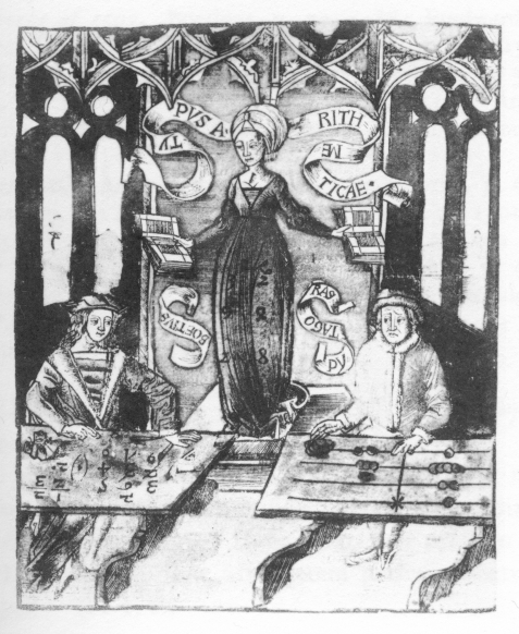
Gregor Reisch, Margarita philosophica. Freiburg: Johann Schott, 1503.

This plate is an allegorical representation of Arithmetic as a female figure bedecked with Western (Hindu-Arabic) numerals. At her left hand sits Pythagoras, using the counting-board (abacus) with loose pebbles on lines. At her right hand is the sixth-century philosopher Boethius, once thought to be the inventor of Western numerals. By turning her head towards the latter man, Arithmetic indicates her favor to the new system. The discourse over the efficiency of different arithmetical techniques (e.g. Roman vs. Western numerals) reached its climax in the fifteenth and sixteenth centuries, as the newly literate middle class moved away from arithmetic as traditionally practiced in medieval universities, and as commercial arithmetic texts began to be produced in large quantities advocating the newer Western system.

Signs of the times: a winner

Congratulations to Katherine Tong for correctly figuring out the answer to the puzzling inscription from yesterday’s post.

As you will recall the inscription was as follows:

This very perplexing because the final letters of StatE and UniversitY are enlarged, but not the final letter of WaynE.  As Katherine correctly points out, this is because on various places in the Wayne State website, as well as letterhead, and other inscriptions around campus, the words are arranged as follows:

with the words in two lines.  To only enlarge the W, S, and U would look unbalanced in this context, because the leftmost W and U would both be enlarged, giving it a definite leftward skew, so the final letters of ‘state’ and ‘university’ are also enlarged.  The final E in Wayne is not treated this way, however, because it falls in the middle of the line.    As Katherine points out, if this inscription intended for two lines (or one originally on two lines – there’s no way to tell) were put on a single line, the result would be the incongruous one seen in the puzzle.

It’s worth noting, though, that the U and Y in UniversitY are lowered, not raised as in the first inscription; it wouldn’t make any sense at all to lower the U and Y in an inscription where there is only one line – in fact, it requires there to be a constant typographic baseline.  When there are two lines, having a constant baseline wouldn’t make any sense because then the raised U and Y would create a gap between the baseline of the top row and the mean line of ‘niversit’.   This makes me suspect that someone just said to the people in facilities, ‘Give me a set of Wayne State University letters’ and then received the letters (with the enlarged W, S, E, U, and Y) but then, when actually laying the letters out on a single line, just put them in the way that made the most sense.

There is a third letter pattern seen around campus, which is the ‘correct’ single-line layout, with a fixed baseline and only the initial letters enlarged/raised:

Here, one could raise the last letter of UniversitY, but there is no great incentive to do so; in the second image above, both the W and U were on the left, and thus cognitively demanded some balancing, but here, the raised W, S, and U are relatively evenly spaced throughout the single line.

Issues such as these are of constant concern in the fields of typography and graphic design,  but in the anthropological and archaeological study of writing systems, and indeed in classical epigraphy, they are almost completely ignored, which I think is a serious mistake.   Epigraphy can tell us a lot about the aesthetic interests of a society, and the way in which certain principles are emphasized is not just a casual choice, but reflects decisions made for understandable reasons – some meaning-bearing (semantic), but others reflecting aspects of script far removed from the direct graphic communication of meaning.

Liz Throop, a professional graphic designer / design instructor, has discussed the cognitive and aesthetic shifts required when integrating the Western numerals into early European printing technology (Throop 2004).  This is a topic that I will be expanding upon at the International Medieval Congress next spring at an AVISTA session run by my colleague Shana Worthen.    Similarly, my colleague John Bodel at Brown, who is a Roman epigrapher, introduced me to his concept of ‘paragram’: signs and graphic conventions that normally stand outside writing systems as conventionally conceived and yet which play a crucial role in shaping how we understand and read texts.  Thinking about these sorts of quasi-aesthetic decisions has forced me to go beyond the question ‘What is the set of valid signs in X script/numerical system?’ and to think about the way that graphemes are designed, combined, arranged, and modified for various purposes in various contexts.

I should add that it may not be a coincidence that Katherine, who was one of my honours thesis students last year, and has now moved on to bigger and better things at the University of Toronto, was the first to correctly determine the explanation.  While she is not exactly a ‘ringer’ in this contest, she is the author of a truly exceptional paper, and certainly the most bizarrely titled: “THE MR MAROR TO BE JOLLY LA LA LA LA LA: An investigation of writing (and gibberish) on Dollarware” (Tong 2008), which is part of The Dollarware Project.  It is an analysis of the aesthetic, semantic, and just plain bizarre text found on discount ceramic mugs, and is (if I may say so) better than her thesis, and seriously in need of a peer-reviewed publication venue.

Katherine will be claiming her prize shortly, the privilege of choosing the topic of an upcoming post here at Glossographia.  Congratulations!

Works cited

Throop, Liz. 2004. Thinking on paper: Hindu-Arabic numerals in European typography. Visible Language 38(3): 290-303.

Tong, Katherine. 2008. THE MR MAROR TO BE JOLLY LA LA LA LA LA: An investigation of writing (and gibberish) on Dollarware. Dollarware Project, report 17.  http://dollarware.org/report17.pdf.